This is one of a series of looks at advertising in cycling, mostly informed by looking back through past issues of Procycling magazine.
The bicycle saddle inhabits a peculiar dichotomy of worlds – it is both the most important physical, and least important aesthetic, part of a bicycle. It is your primary contact point, yet precisely because of that, it’s the least seen part of the bicycle. A good saddle then, is an essential piece of function over form, and not a particularly thrilling or exciting aspect of the bicycle organism – a frame, groupset or wheels are exciting, yes, but a saddle? Hmm.
Indeed, bicycle saddles are the sort of thing that those outside the cycling world seem to associate with some sort of perversion, with those who haven’t ridden a bike usually asking “how do you sit on that? Isn’t it uncomfortable?” and bringing up the old wives tail of them making men impotent. Given Lance Armstrong managed to get a testicle lopped off, have cancer treatment, ride nine further Tour de Frances, then conceive naturally, and pros are perenially leaving the Tour to be at their partners’ side for births, that seems a bit more like tabloid wishful thinking.
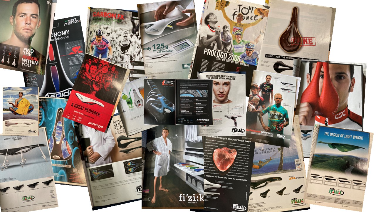
How then, do you sell a bicycle saddle? I had a look back through the Procycling back catalogue to see what printed material the Mad Men (and women…) tried to use to flog us what essentially amounts to some padding and leather, and tried to group them into some broad categories. Fizik, Prologo, San Marco and Selle Italia were the main four companies that put their ads in – companies like Specialized, Bontrager et all didn’t have any saddle specific ones, but then their catalogue is much larger – all Italian companies, so surely there would be some flair. Fabric, another, are based in the UK.
Comfort
Contrary to what you’d expect, comfort wasn’t the major driver used to get people to spend their cold hard cash on a saddle. Surprisingly, not one used a cushion in an ad, which seemed the obvious metaphor, and there were only a few ads that really even focused on comfort.

Only Selle Italia seemed to focus on Comfort exclusively, with the claim that it was “in their DNA” and that their signature “superflow” cutout reduced pressure by 50% (as with most of these sort of statistics, it’s unclear as to what they’re comparing against). Mixed messages came from their use of a combination of science and medicine, with a doctor, complete with a stethoscope, being deployed to add weighty credibility to their “scientifically designed for maximum comfort” line, which was backed up with some pressure scans.
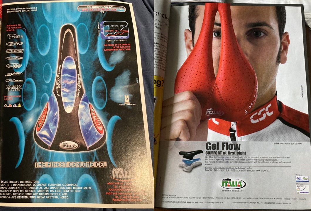
Before the oversized cutout became their major innovation, Selle Italia were more excited about Gel, or as they called it “Gel Flow”, promising less “impact” via a dubious looking graph on the top right of the left hand advert. The Gel was variable thickness, which was never really explained as to why it was a positive, but it was noted that it let them account for the different anatomies of men and women.
So protective of their Gel concept were Selle Italia, they decried imitators as “fake” and made sure everyone was sure they were the original, as well as comparing their saddle to a beach side hammock.

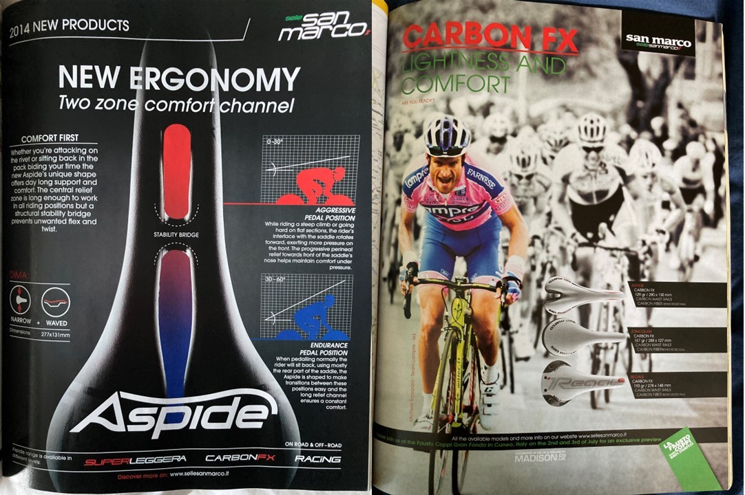
Meanwhile, rivals San Marco (who, er, are actually owned by the same company) were advertising their “two zone comfort channel”, which may have had something to do with Selle Italia having the patent for the “one zone” superflow channel, so San Marco stuck a “stability bridge” in, didn’t explain what the rationale was, and that was that. But it produced “comfort first” apparently. Otherwise, comfort took second place to lightness, with an image of the late Michele Scarponi used to show saddles that didn’t have any cutouts.
Lightness
Perhaps it makes sense that a piece of equipment that doesn’t get seen much is seen by professionals as something that can be reduced in weight as much as possible to fulfil its function. The manufacturers decided that the general public would probably want the same, and so light weight is the main message they wanted to convey.
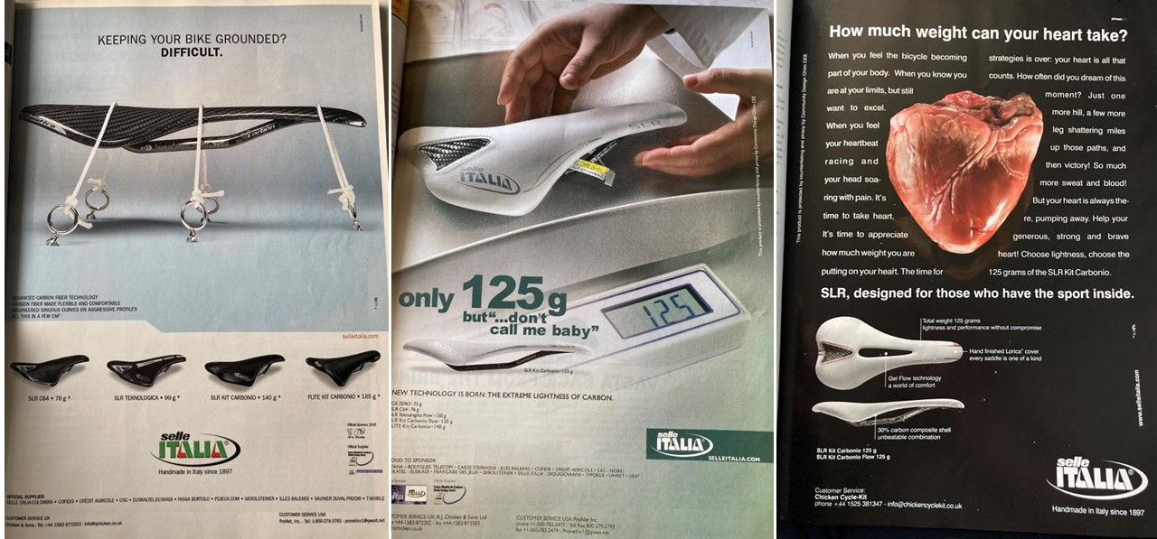
Selle Italia have a rather varied approach to letting us know this information. There’s the classic “we need to hold it down it’s so light” approach, where the saddle is held down to the ground a la Gulliver’s Travels. The lightest saddle on the ad was just 76 grams – still not light enough to float, but you get the idea.
Then followed a peculiar one that told us that the saddle weighted “only 125g – but don’t call me baby.” Eh? There was no further explanation for this bizarre statement. Maybe I’m not down enough with the kids to know what this was all about. Finally, and perhaps the cleverest, was the advert that asked readers to consider their health – “how much weight can your heart take?” Never mind the comfort (although it did extol the virtues of the “world of comfort” its gel would bring) – this was suggesting that weight was all that mattered in a saddle.

Elsewhere, they employed some classic natural imagery to make us realise how floaty light their jerseys would be. Dandelion seeds getting caught in the wind were used to tell us that they were “probably” – presumably there was some saddle lighter they didn’t make, so they couldn’t say “definitely” – the lightest saddles in the world, and a leaf was utilised to suggest the Italians were the up their with the natural world in their design.

Fizik, however, went with a more minimalist approach, which you’d think would be obvious element to use for talk about lightweight components. “Less is more” was the strapline, although they were keener to tell us all about the comfort of their saddle as well. They boasted that they “Blended” strength and comfort in the “lightest” package, and how they’d used materials and techniques to remove weight to the sum of 70 grams. A butterfly was also deployed – an excellent image for delicate, lightness and beauty – which nonetheless featured some odd language. The name “scratch” seemed a bit harsh for a saddle, as did the suggestion it would be “resistant to penetration” – what was it going to be penetrated by?! Not the thought you want of something so close to your nether regions…
Flexibility
One area leant on heavily by Fizik was flexibility, with their “spine concept”, where by your level of flexibility determined which of their saddles you should use. You could either be a snake (very flexible), a, er, chameleon (sort of flexible) or a bull (not very flexible), with accompanying saddles available:
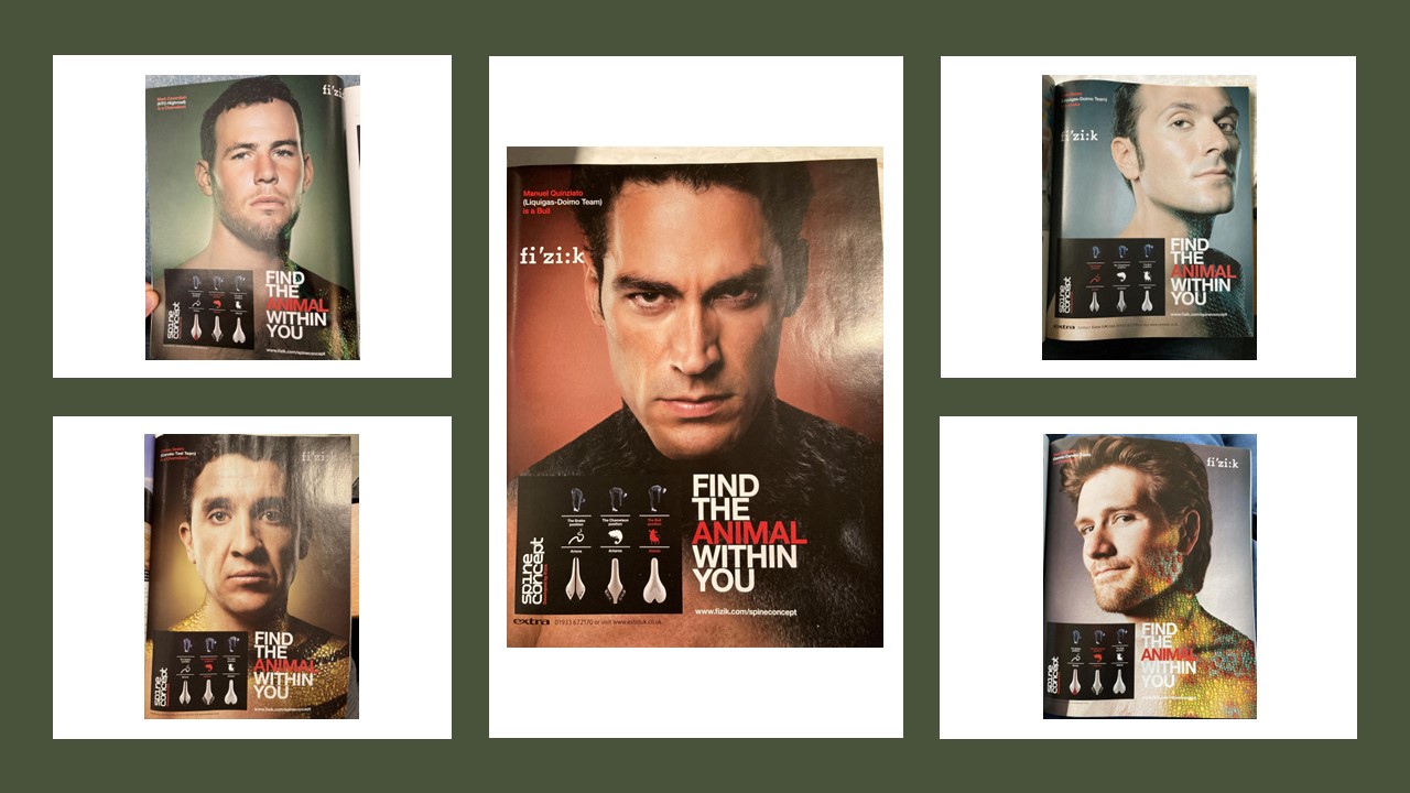
People were encouraged to “find the animal in you” (is saying you’re a snake a good idea given the modern interpretation of the word?!) which were then represented by an electric mix of topless professionals with some of their skin covered in the skin of their relevant animals. With Mark Cavendish, Ivan Basso and Carlos Sastre, they had some established names (this was publishes in 2010), but you get the idea they struggled with finding a “bull” – hence ending up with Manuel Quinziato, who whilst a respected domestique, had a win in the Eneco Tour as his best personal achievement. Prior Tour Yellow Jersey David Zabriske completed the Chameleon mix – although this achievement was voided two years later with his doping confession.
The Pros use it!
As the above suggests, companies saw no better endorsement for their products than from the professionals themselves – after all, if the pros used it, it must be good enough for the common man or woman, right?
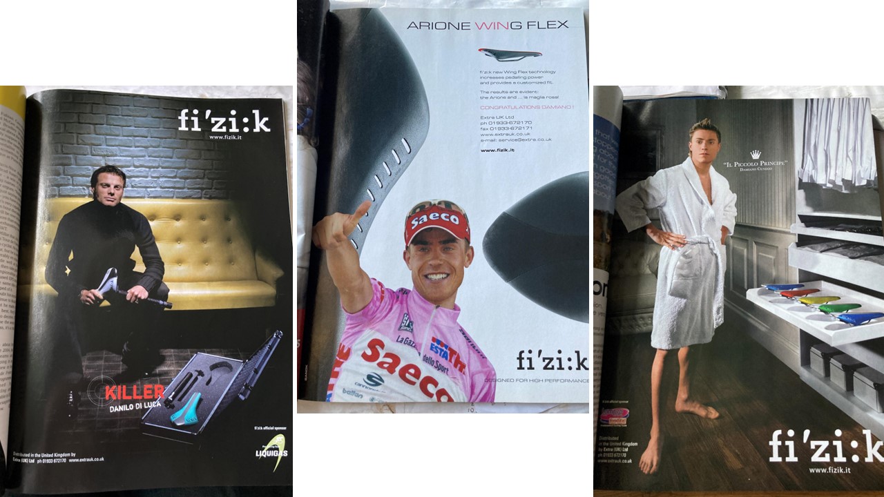
Of course, there’s multiple ways to show how people’s heroes might be using the product. You could utilise their nickname, such as Danilo Di Luca’s “killer”, to suggest he carries around a saddle and seatpost in the sort of bag an assassin would put a rifle in to “whack” his opponents. You could just say congratulations when they win, as Fizik then did with Damiano Cunego in 2004. Or you could suggest he wakes up every morning and selects his saddle from a wardrobe, even if there’s no cycling kit in it.
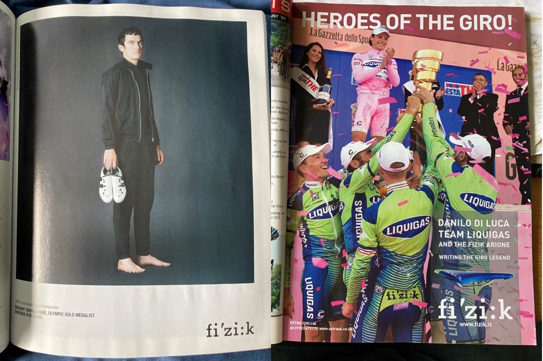
Fizik also featured then Tour winner and Olympic gold medalist Geraint Thomas in a fairly minimalist, portrait style image, which has very little to do with cycling bar the shoes in the photo. A more vibrant image was of Danil D Luca and his teammates from Liquigas celebrating his in no way dubious victory at the 2007 Giro, along with a saddle in the teams signature lime green colourway.
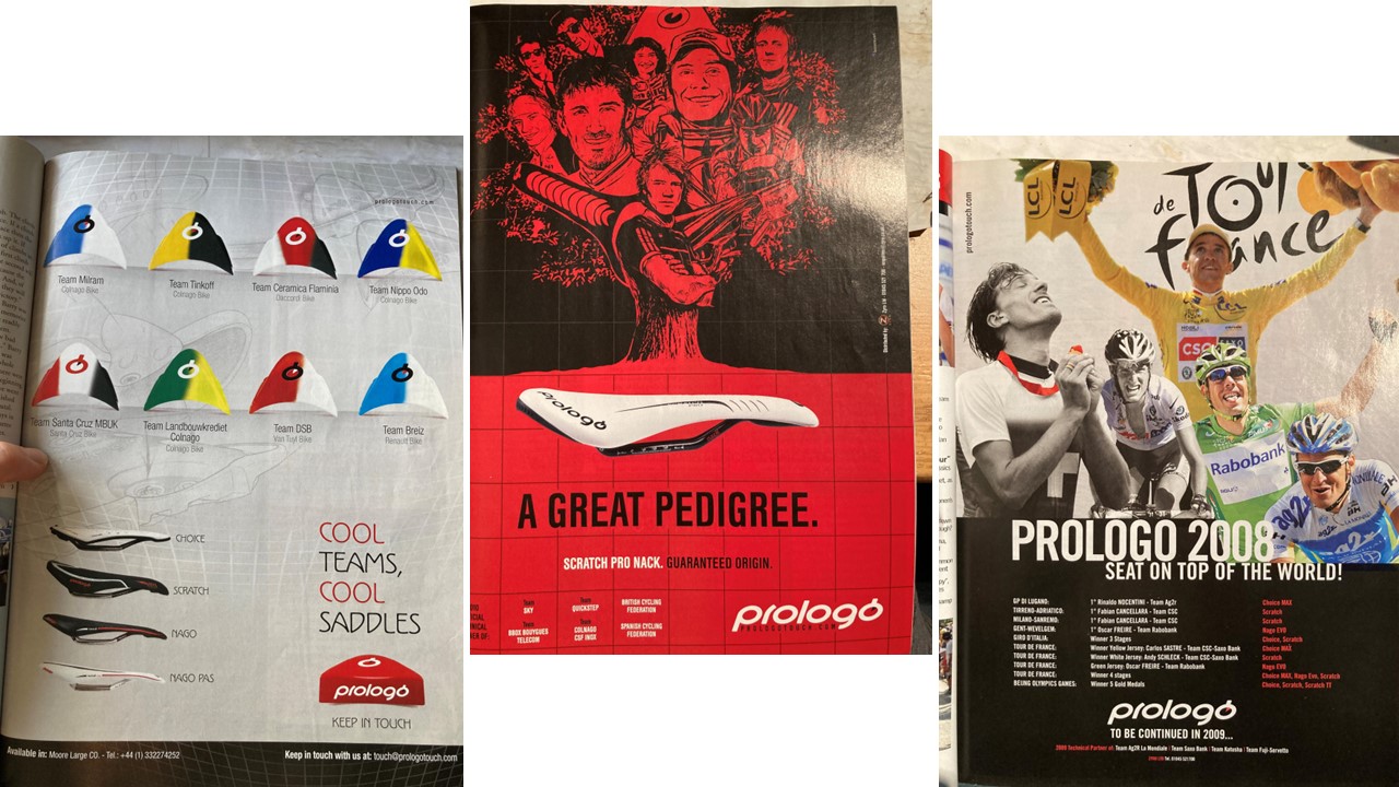
The number of teams one sponsored was a point of pride for Prologo, who, using the little tabs they added to the rear of their saddles, showed off that eight “cool” teams they were using. They then suggested that their saddles had a “great pedigree” with a tree showing the various successful users of their saddles growing out of it, before the 2008 advert showing that they had managed to take three out of four jerseys and an Olympic Gold with riders who’d placed their behinds on their products. Not exactly pretending it had made the difference, but still.
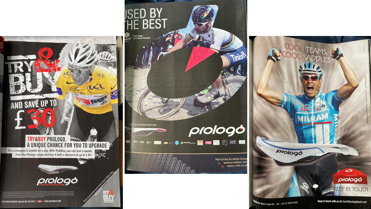
The idea the best used your products was one Prologo came back to lots, using Peter Sagan inset into “O” styled as a stopwatch that Prologo used as a brand. Alessandro Petacchi was their earlier ambassador in 2006 – before his salbutamol case put paid to that.
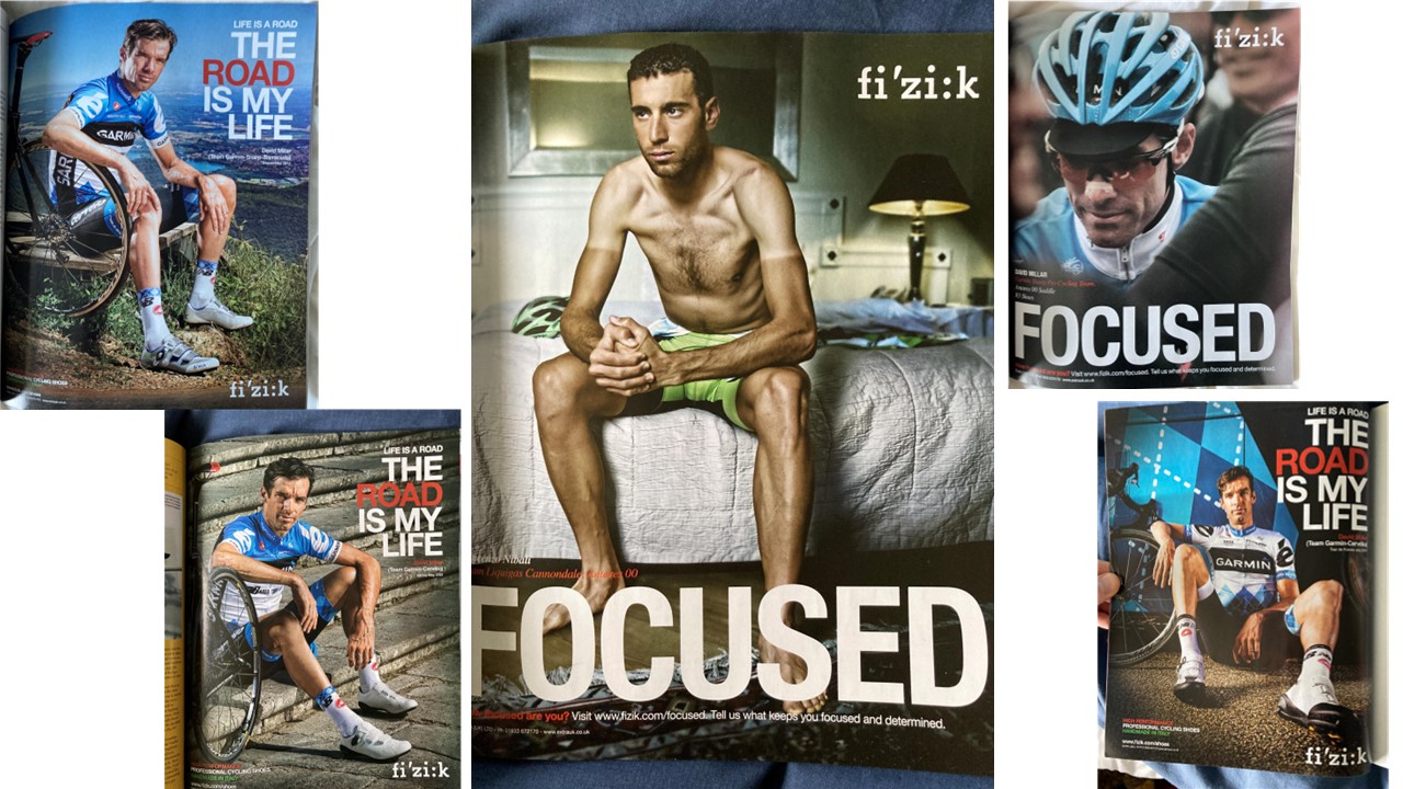
Not that doping was necessarily a blocker to being in ads. David Millar, the pious converted (we’ll ignore the part where he told the press he was innocent having already confessed to the police) has done quite well out of it, what with his clothing range, commentary gigs, and patented “sitting wit an arm on a wheel” FIzik ads. They were technically for shoes and saddles, but only actually showed the saddle in one picture. Which is more than can be said for Vincenzo Nibali’s ad (for clarity, Nibali is not a doper) – he was shown “focused” sitting topless on a bed, with the blurb telling us he was using the Antares 00 and encouraging people to tell the company what “kept them focused and determined.”
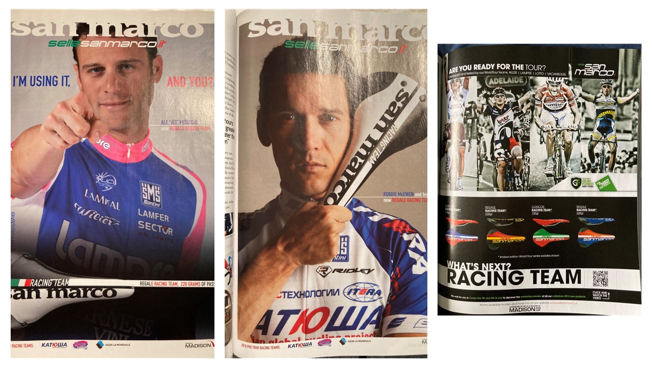
Further proof of redemption could be found in Ale-Jet’s return to advertise Italian rivals of Prologo San Marco, with a tag line that, in the context that Petacchi had lost results for salbutamol abuse, seemed a bit sneaky – “I’m using it, are you?”.
Still, the direct appeal to people that a professional was using it, therefore it was good enough for them, was never more clearly expressed than it was here. And not at all coloured by Petacchi being banned for blood doping in the Aderlass investigation in 2019…Robbie McEwen, by this point riding for Katusha, was also roped in, though it was just “his new saddle,” before San Marco utilised a range of riders in 2012 such as John Gadret, the Giro podium finishes, Andrei Greipel, Michele Scarponi, and Liewe Westra to show off their coloured saddles. Interestingly, coloured saddles have never really taken off – white or black, or maybe a combination, but no more.
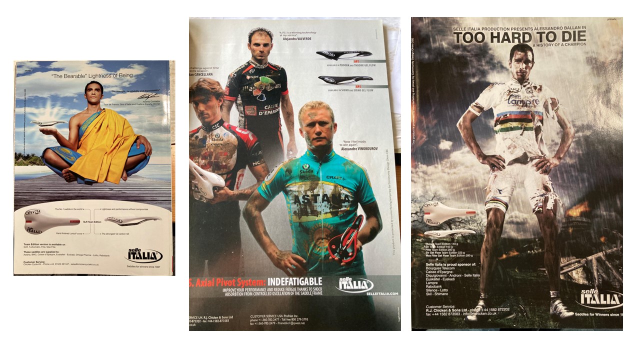
Some adverts tried to be slightly more inventive in their use of the pros. Selle Italia wanted to emphaisie lightness and the fact that Tour winner Alberto Contador used their perch, so dressed him up in a robe with the Kazak flag and a golden (presumably yellow…) tunic to boast of the “Bearable lightness of being.” presumably the idea was to convey some sort of ancient Buddhist wisdom. Weird, given the Budhist population of Kazakhstan in 15,000 (0.07%) and the paraphrased “The Unbearable Lightness of Being” is from a 1984 book by Milan Kundera. Still, the “saddles for winners since 1897” bit was probably fair.
Covering riders in mud and having them claim the saddle was an “extra weapon” and “special technology at my service” to adveritse adapting the rails to absorb shocks better didn’t last long, as Vinokourov was in disgrace by July, but the special award for most “that’s what she said” copy goes to whoever decided that Alessandro Ballan should be graced with the line “Too Hard to Die.” It was a bit unclear what the point was, but hey, apocalyptic landscaped look cool, right?!
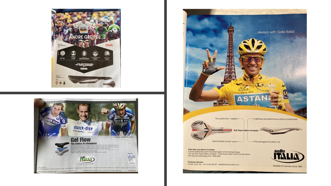
Finally, a bit of a mix – some actual infographics on reasons the San Marco regale saddle was useful to Andre Greipel appeared below him, which made a change from just shoving a pro in your face and going “look, they use it!.” Selle Italia had done this before with Quick Step back in 2006, when the “Gel Flow” was in its infancy, and did try a bit with Contador and his abortive third Tour title. That said, the Eiffel Tower…that could look like a saddle couldn’t it? Why hasn’t anyone tried that?
Prestige
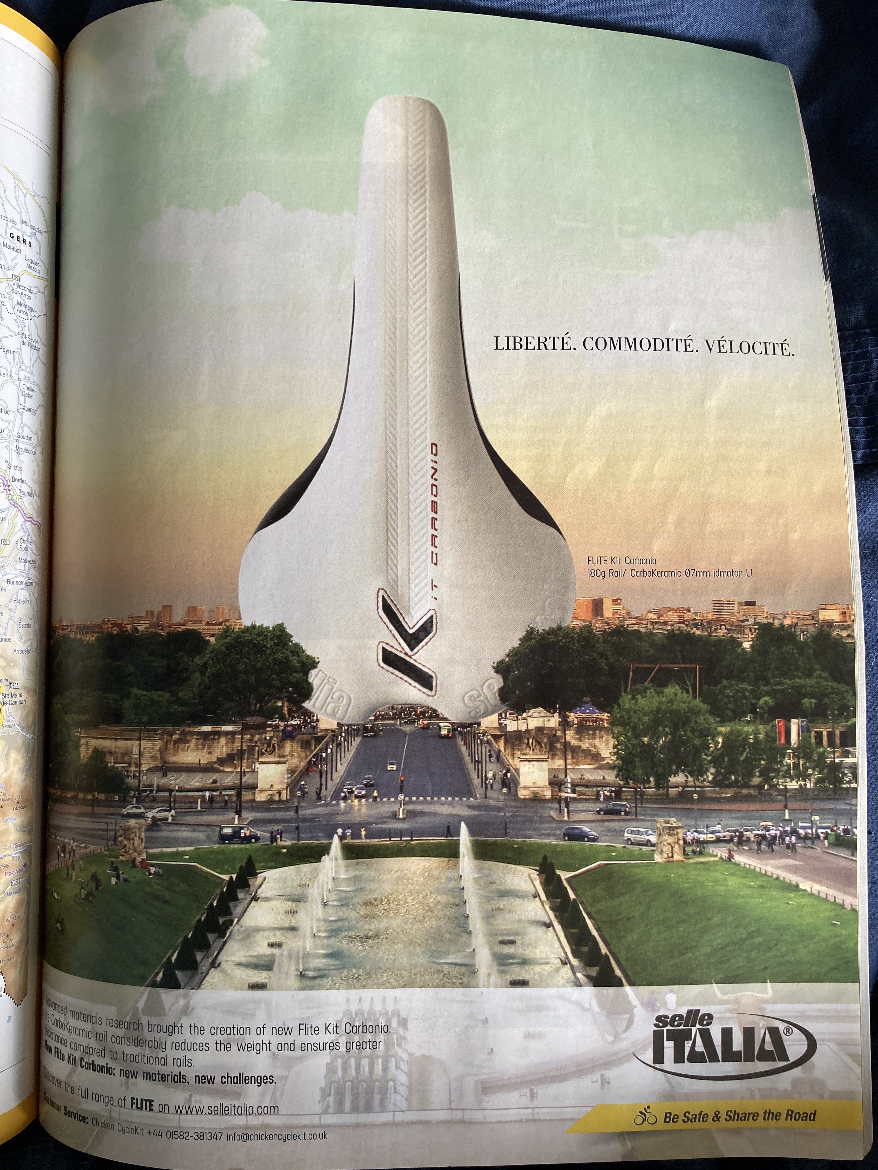
Oh, they have. Yes, Selle Italia adapted the French national motto, although out went equality and fraternity and in came commodite, which I believe is more around ease and pleasantness, and velocite, i.e. speed. Replacing the famous landmark gave the suggestion that Selle Italia were part of the background, the very fabric of the Tour, and set about giving them some historical prestige. This was not something the adverts were always so keen to build upon: I can find only one other advert really looking back to the past, rather than being rooted in the present:
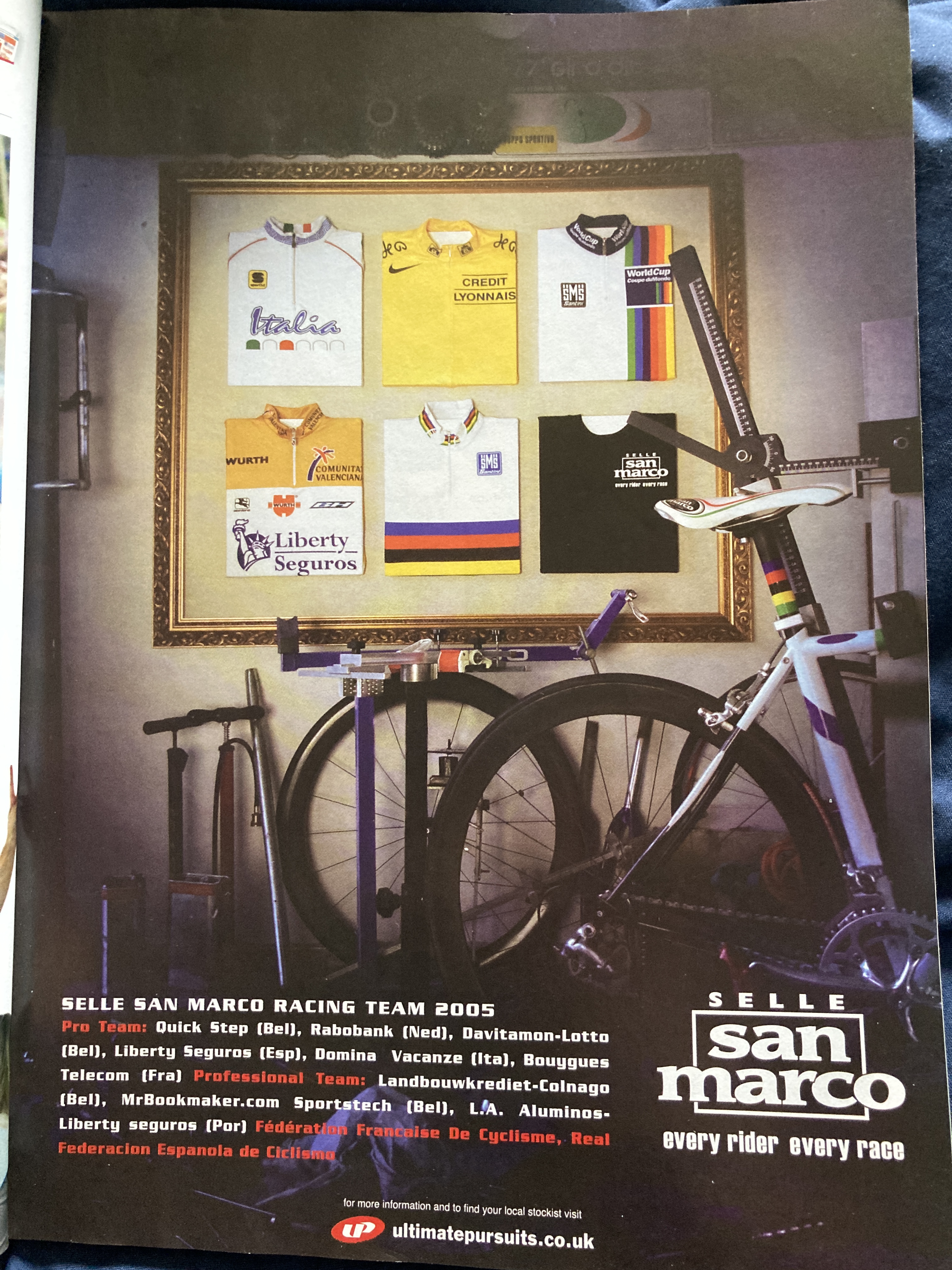
In 2005, San Marco used a picture Frame to show the past victories they’d taken with riders using their saddles (presumably the black jersey isn’t meant to be the Giro d’Italia’s maglia nera for last place, although given it claims to be for “every rider, every race”, it could well be), such as the World Cup (defunct in 2005), World Championships, Tour de France and Vuelta – The Italian jersey was presumably a reference to Paolo Bettini’s Olympic win, and the fact the Olympic symbols are fiercely protected by copyright and so can’t be used.
Innovation
How do you make a seat innovative? Well, they’ve certainly tried:
“Flex” has always been a big deal with saddles – if they “flex” with the rider, it’s somehow a biomechanical advantage apparently, and aids comfort. This is mostly achieved by the properties of the saddle material and the rails having some built in give, as well as changing the shape and placement of the rails for more of a turning moment. Selle Italia had other ideas though – they chopped the back out of a saddle so that the nose was essentially an axle around which the two “wings” could pivot.

If you can’t change the saddle, why not change what it attaches to? That was the thinking behind Monolink: Selle Italia’s attempt to sell you both a saddle and a seatpost in the days before rampant integration made the aftermarket seatpose market collapse. Monolink was apparently stronger, lighter, more adjustable, and easier to use than other saddle/seatpost combos on the market, which they claimed made it “the most advanced” – big words for a saddle.
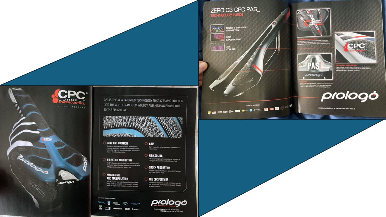
Customers with Trypophobia were evidently not high on Prologo’s wish list, however, as they revealed their CPC technology, standing for Connect Power Control, which revolved around lots of tiny rubber, and there’s no other word for this, suckers, which apparently gave grip, massaged you, absorbed vibration, and even “air cooled” you. This was taking Prologo into the age of “nano technology” apparently – notice they didn’t say they were actually using it, because nano technology is meant to be materials that are 100 millionth of a millimetre or less, rather than just a few small bits of rubber.
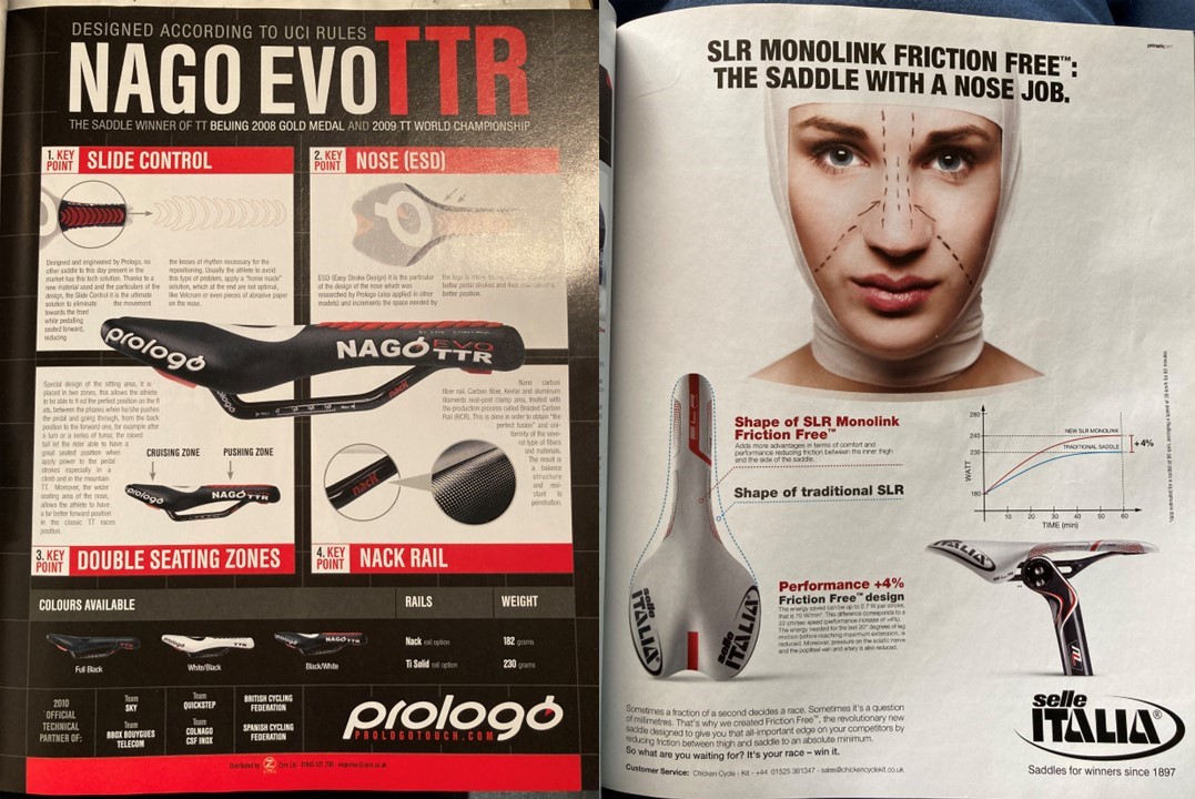
Before the CPC, Prolofo had “slide control”, which was basically just some grippy ridges that stopped you moving up and down the saddle. This is from the era where riders were applying sandpaper to their saddles for grip, destroying their saddles, and more (there’s some gory photos of Tony Martin post TT somewhere) in the process. But they also claimed to be employing “ESD” – Easy Stroke Design. This was making the saddle slimmer so that your thick thighs didn’t hit it as often, and thus “better pedal strokes.” Whilst Prologo liked their acronyms and pseudo-science talk, Selle Italia decided they’d just the same process “giving a saddle a nose job”, and got to put a picture of a pretty lady on their ad. They claimed this would increase performance by 4% – seriously guys?! – thanks to it being “friction free.”
Length
Talking about length with something as phallic looking as the saddle is always dangerous territory, but manufacturers have decided that both lengthening and shortening the saddle can be advantageous to the consumer.
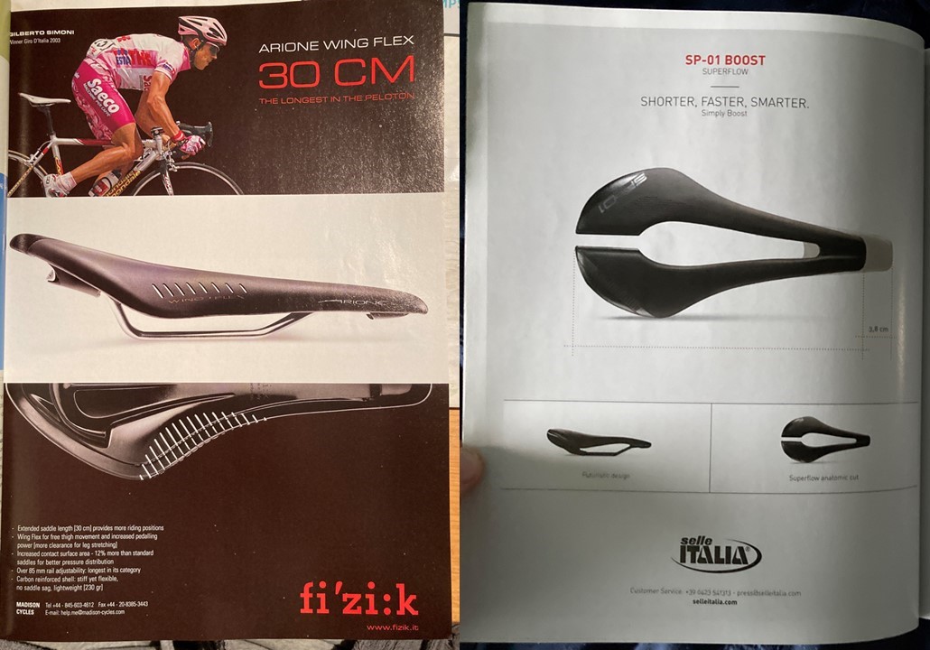
Fizik’s Arione, for instance, was famously a “long” saddle, and they spoke proudly of its 30cm length, claiming it gave you a range of positions to sit in. Selle Italia, however, embraced “shorter, faster, smarter” – without really explaining why the shorter saddle was a benefit. Supposedly, the logic is that it makes you sit further back on the wider part of the saddle, and that this reduces pressure etc.
And the rest…
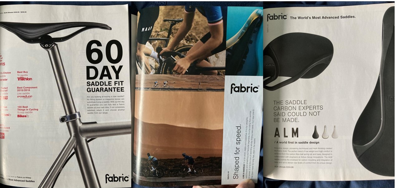
Finally, some of the adverts that didn’t really fit into any category. Fabric were one of the companies that had adverts in, and they were, well, a bit meh. Saying you can use the saddle for 60 days ain’t all that sexy, nor is a list of awards and recommendations, but that’s what Fabric wanted. They also apparently had “ALM” – an unexpanded upon acronym that seemingly was just a leaf spring, though it was “developed by Airbus.”
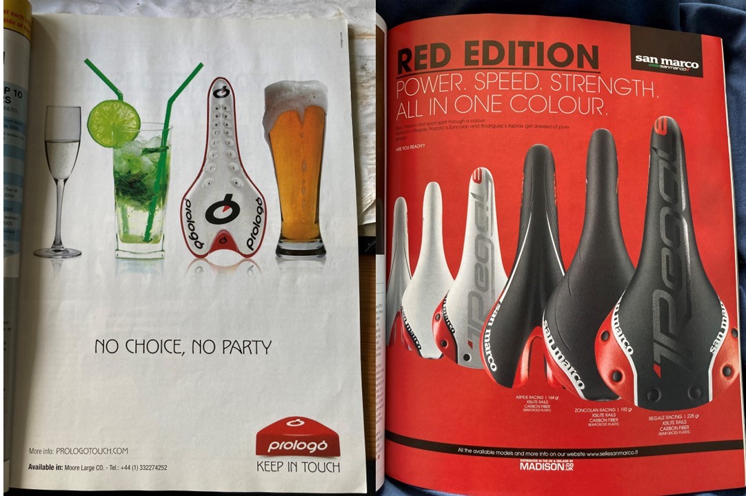
Prologo has perhaps been on a bended when they made a slightly odd advert showing a saddle amongst a line up of alcholoic beverages, promising there was “no choice, no party” – whatever that means. And there’s always someone who just tries to sell someone with the colour red, as San Marco’s “Red edition” did – no different to normal, just with some red bits on. Wow.

Leave a comment